 TruePx
 Docs / Side panel
Element tab
Everything about one element: its size and spacing, its CSS three ways (computed, source and Tailwind), its colors, fonts, effects, images, and any contrast problems, with a one-click fix.
Open it#
Open the side panel from the dock (0), then click an element on the page. The Element tab shows the element you selected and stays on it while you scroll and hover elsewhere, until you select another one or release it (Esc). With nothing selected, it shows a short reminder of the main shortcuts.
Sections appear only when they have something to show: no Gradients section for an element without gradients, no Canvas section unless it’s a <canvas>. Click a section’s title to fold or unfold it.
Header#
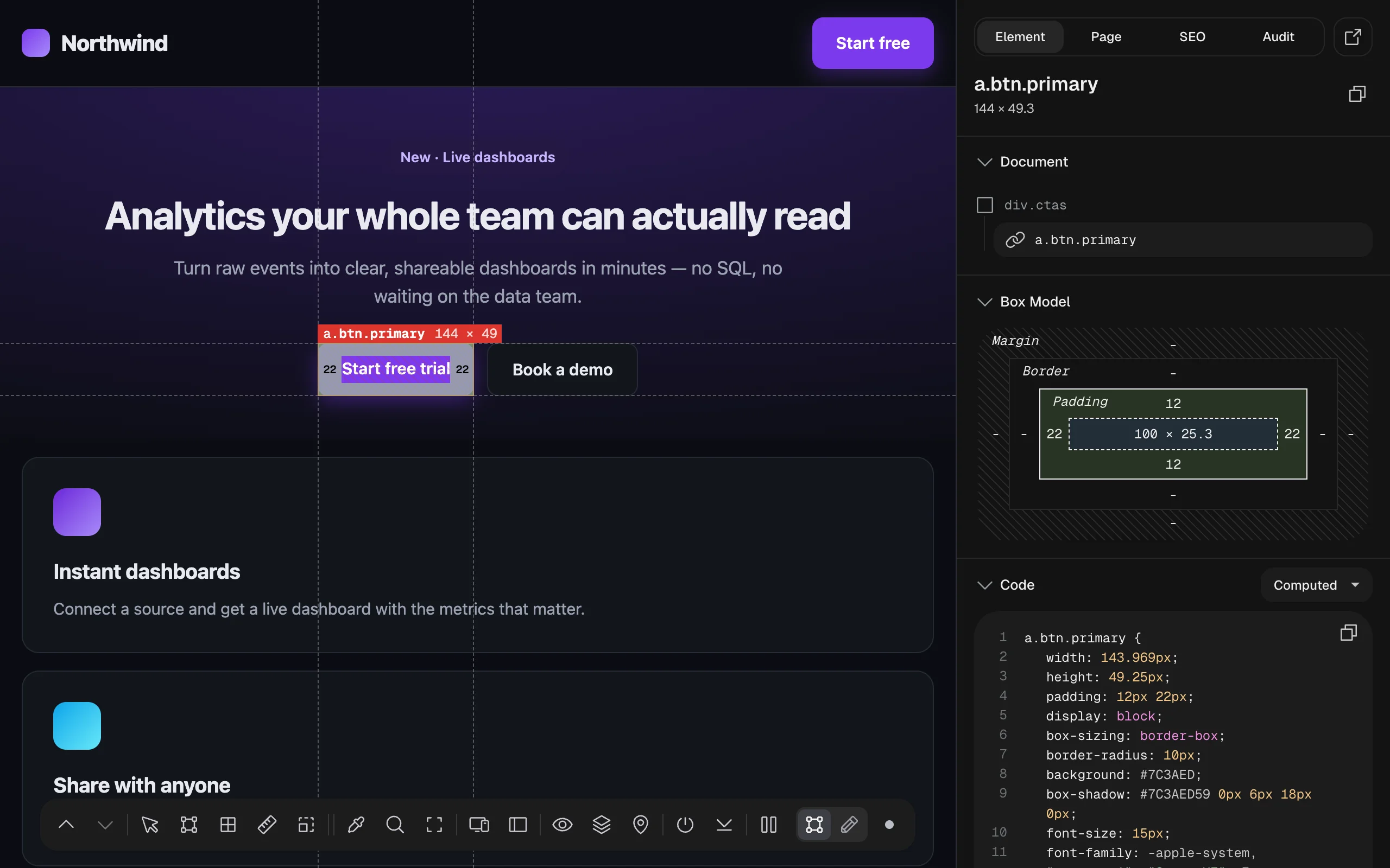
- The element’s selector (tag, id, classes) and its size to one decimal, for example
144 × 49.3. - Copy selector (the copy icon) copies a CSS selector for it.
- Force state (the hand icon, shown only when the page has
:hover,:focus,:activeor:visitedrules for this element): choose a state to make the element look and measure as if you were hovering, focusing or pressing it. Choose Default to go back. Handy for checking hover colors and focus rings without holding the mouse still.
Document#
Where the element sits: its parent (greyed) above it, with an icon for the kind of element. Click the parent to select it, the same as Select Parent on the dock.
Box Model#
The CSS box model as a diagram: margin outside, then border, then padding, and the content size in the middle. Each side shows its value in pixels; a dash means zero. Fractions are kept (25.3), so you see what the browser really laid out.
Code#
The element’s CSS, in the view you pick from the menu on the right. The copy icon copies the whole block.
- Computed: the final values the browser uses for this element (width, height, padding, display, colors, fonts, shadows…), written as one CSS rule. Colors are shown as HEX.
- Source: the rules from the page’s stylesheets that match the element, in order, including those inside
@mediaqueries. Declarations overridden by a later or more specific rule are struck through. The stylesheet’s name is shown under the rules. - Tailwind: the computed styles translated into Tailwind CSS (v4) utility classes, to paste into a Tailwind project.
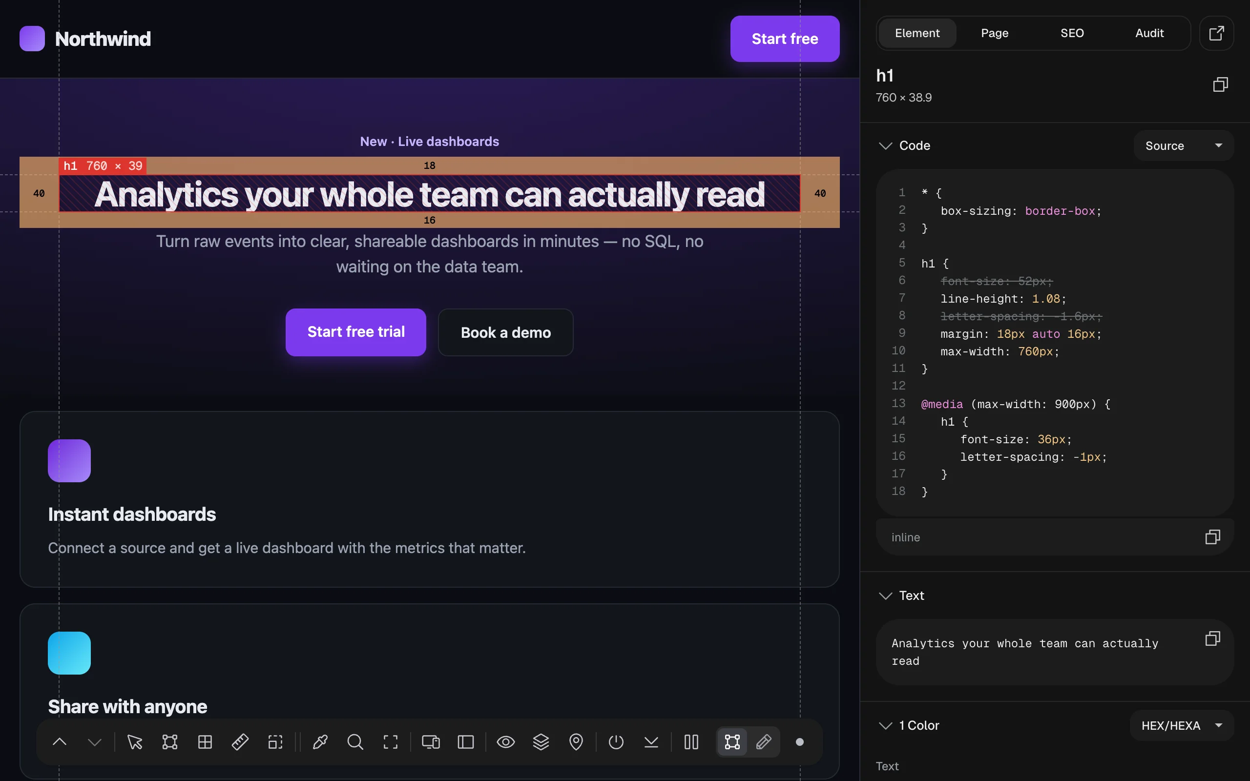
@media (max-width: 900px) rule wins, so the base rule’s font-size and letter-spacing are struck through.Stylesheets loaded from another site (a CDN) can’t be read by extensions, so their rules don’t appear in Source; Computed always shows the final result.
To change the CSS, switch to Edit mode and use the CSS tab.
Text#
The element’s text content, with a copy button. Useful to grab copy from a page without fighting the selection.
Layout#
For a flex or grid container: a small diagram of its direction, how items are aligned along each axis, wrapping, gap and (for grid) the columns and rows, plus the values as a list. It answers “why is this item here?” faster than reading justify-content and align-items by hand.
Canvas#
For a <canvas> element: the drawing Context it uses (2D, WebGL, WebGL2…), its Canvas size in pixels, and the Device pixel ratio, to spot a canvas that’s drawn at too low a resolution for the screen.
Colors#
Every color used by the element and the elements inside it, grouped into Text, Backgrounds and Borders. Click a color to copy it. The menu on the right switches the format: HEX, RGB, HSL or HSB (with alpha when the color is see-through).
Gradients#
Each CSS gradient on the element, drawn as a preview bar, with its CSS ready to copy.
Typography#
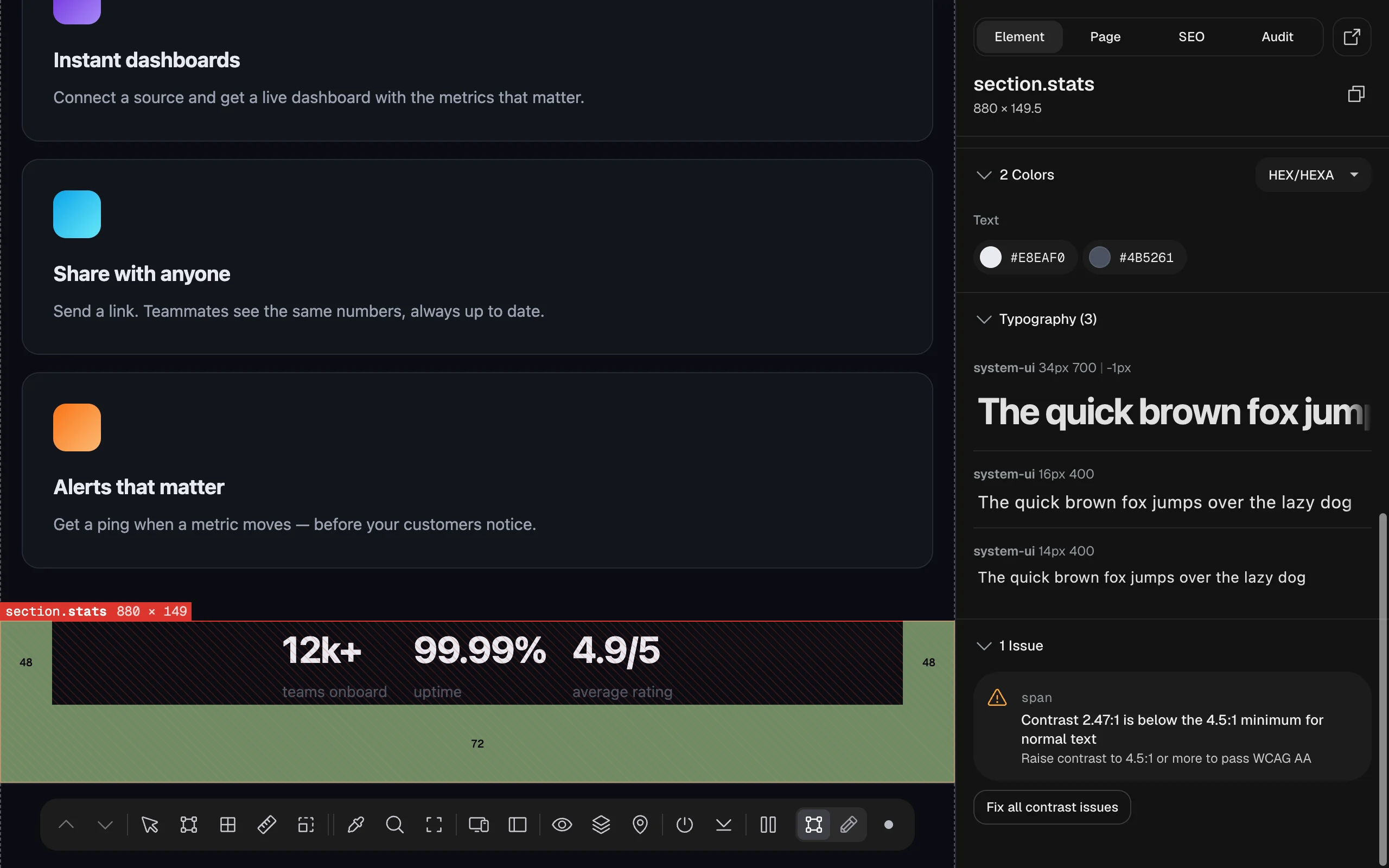
Each distinct text style used inside the element (font family, size, weight and letter spacing), with a specimen line set in that exact style (“The quick brown fox…”), so you can see which font really rendered.
Box Shadows, Animations and Transitions#
- Box Shadows: the shadow drawn on a sample box, and every layer written out on its own line (color, offsets, blur, spread), top layer first, ready to copy.
- Animations: each CSS animation with its settings and its
@keyframes, and a chart of its timing curve. - Transitions: which properties transition, for how long and with which easing, with the easing curve drawn.
Assets#
The images and SVGs inside the element, as tiles with their format and size. Click a tile to download it, or use Download All. The sun/moon button switches the tiles to a dark background, so white logos and icons are visible.
Issues#
Contrast problems in the element and the elements inside it, measured with axe-core, the engine behind Lighthouse:
- Below the AA minimum: text under 4.5:1 against its background (3:1 for large text, 24 px or 18.5 px bold). These need fixing.
- Passes AA but not AAA: text that meets the usual standard but not the stricter one (7:1, or 4.5:1 for large text).
- Icon contrast: icons and graphics under 3:1 (WCAG 1.4.11).
- Can’t be measured automatically: text on a photo, gradient, video or under another layer, where the background has no single color. Check these by eye or with the color picker.
Fix all contrast issues (shown when some text fails) changes each failing text color by the smallest amount that passes and reports how many it fixed, for example “Fixed 3 element(s), 0 already passing.” It’s a live edit: Undo on the dock brings the old colors back, the Changes tab lists the new colors to copy into your CSS, and they’re saved for the page until you revert them.
For contrast across the whole page, use the Audit tab.