 TruePx
 Docs / On the page
Design QA
Check a build against the design and for the people who’ll use it: see the page as people with color blindness see it, lay the design mockup over the live page, and pin notes on the elements that need work.
Color vision simulation#
Dock: Simulate color vision deficiency (eye icon)
Recolors the whole page the way it looks with a common type of color blindness. Use it to check that charts, status colors, links and error states don’t rely on color alone.
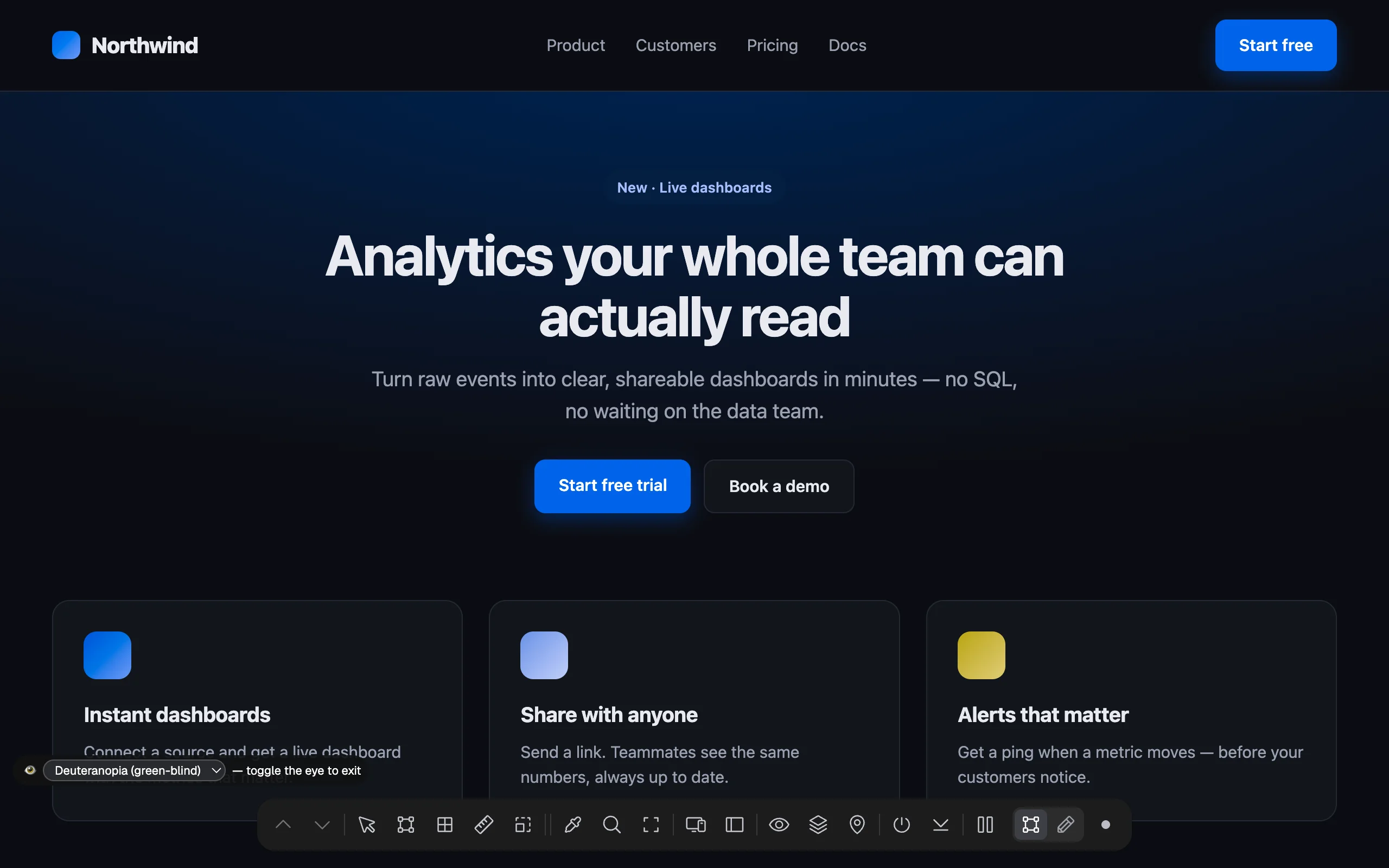
A bar at the bottom left of the page lets you switch between the four types:
| Type | What changes |
|---|---|
| Protanopia (red-blind) | Reds look dark and close to green and brown. |
| Deuteranopia (green-blind) | Greens and reds are hard to tell apart. |
| Tritanopia (blue-blind) | Blues and greens, and yellows and pinks, get confused. |
| Achromatopsia (no color) | Everything in shades of grey; shows whether contrast alone carries the meaning. |
The simulation uses the color model by Machado and colleagues (2009). Click the eye on the dock again to stop.
Design mockup overlay#
Dock: Overlay design mockup
Lays an image of the design (an export from Figma, Sketch or any tool) over the live page, so you can see exactly where the build differs.
- Click the button and choose an image file (PNG, JPEG, GIF, WebP or SVG). Export the full page or frame at the page’s width; an
@2xexport works too. - The image is placed at the top of the page and scrolls with it. A bar at the top of the window controls it.
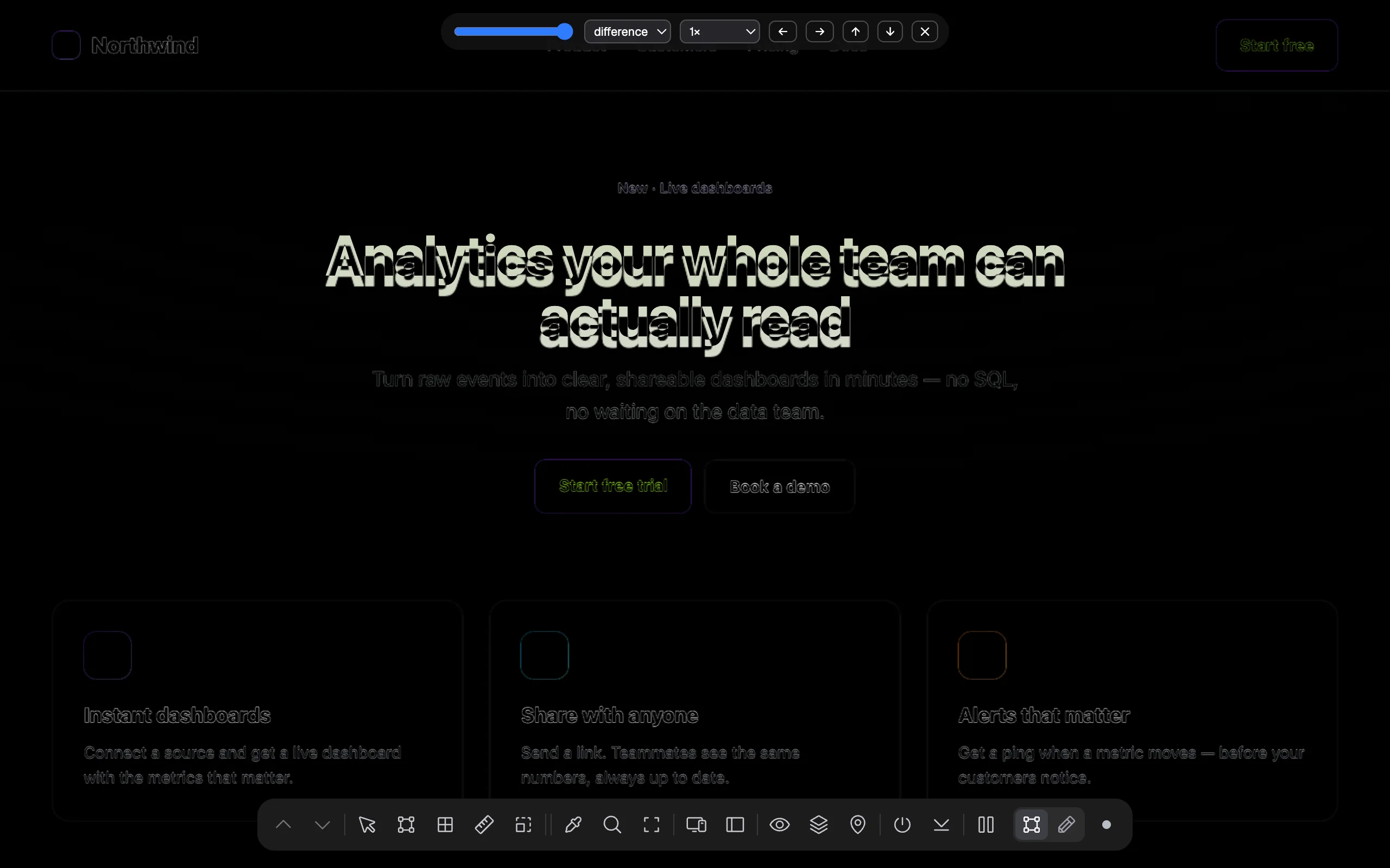
| Control | What it does |
|---|---|
| Opacity slider | How see-through the mockup is (starts at 50%). Slide back and forth to compare. |
| Blend | normal, multiply, difference, overlay or screen. Difference is the one to use for a pixel check: identical pixels turn black, and anything that moved or changed lights up. |
| Size | Fit width stretches the image to the page’s width; 1× uses the image’s own pixels; @2x shows it at half size, for retina exports. A file named …@2x… starts at @2x. |
| ← → ↑ ↓ | Move the mockup 10 px at a time to line it up. |
| ✕ | Removes the mockup. |
The image stays in this tab only; it isn’t uploaded or saved, and it’s gone when you reload the page.
Pins: notes on elements#
Dock: Pin a note for your agent
Pins are notes attached to elements on the page, such as “Make this button 48px tall to match the design”. They’re a to-do list that lives on the page itself, for you or for an AI agent that reads them and makes the changes.
Add a pin#
- From the dock: click the pin button, then click an element. Write the note and press ⌘/Ctrl Enter (or click Pin note). Esc cancels.
- From the side panel: select an element, open the Page tab → Pins, type the note and click Pin selection.
Each pin shows on the page as a numbered yellow marker on its element.
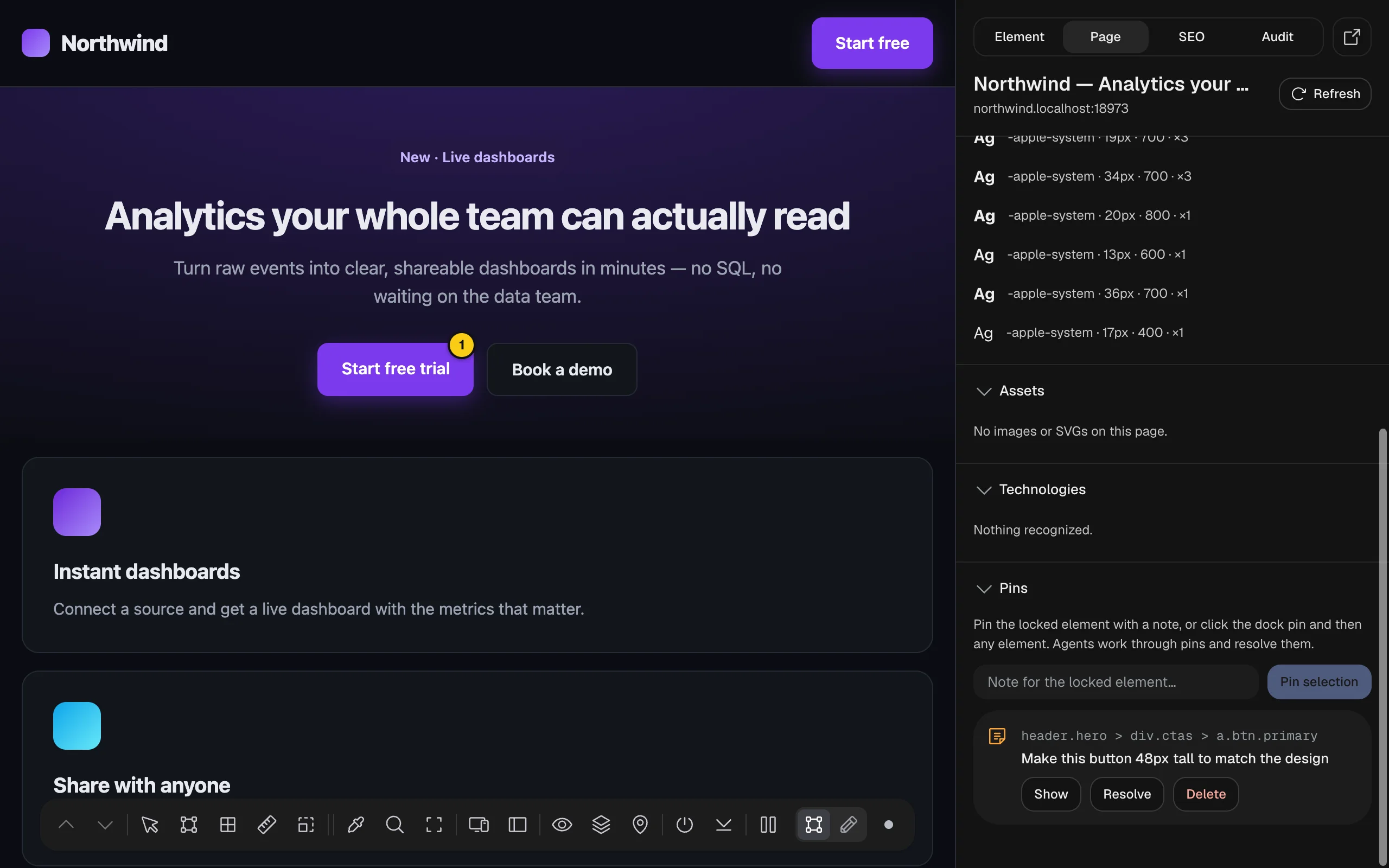 div.ctas > a.btn.primary, the note, and Show, Resolve and Delete buttons">
Manage pins#
The Pins section of the Page tab lists every pin on this page with its element’s path and note:
- Show scrolls to the element and highlights it.
- Resolve marks the pin done; Reopen undoes that.
- Delete removes it.
Pins are saved in your browser for each page address, so they’re still there tomorrow. They aren’t shared with anyone else.